Visual Identity Guideline
As a design department member, you will face the moment to use visual resources such as logo, color and typefaces. To help you use sources in right way, F-U-D (Face of UNIST Design Department) team* introduce the visual Identity Guideline in detail.
Logo
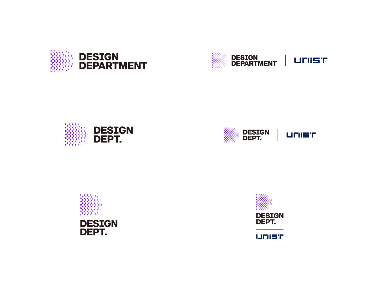
Our official logo is made of the symbol and full wordmark, which should not be used separately. They should come together at any time. If you have any limited usability issue to use full version, you can choose abbreviated version. You can check the logos that you can download in the image below.

Color

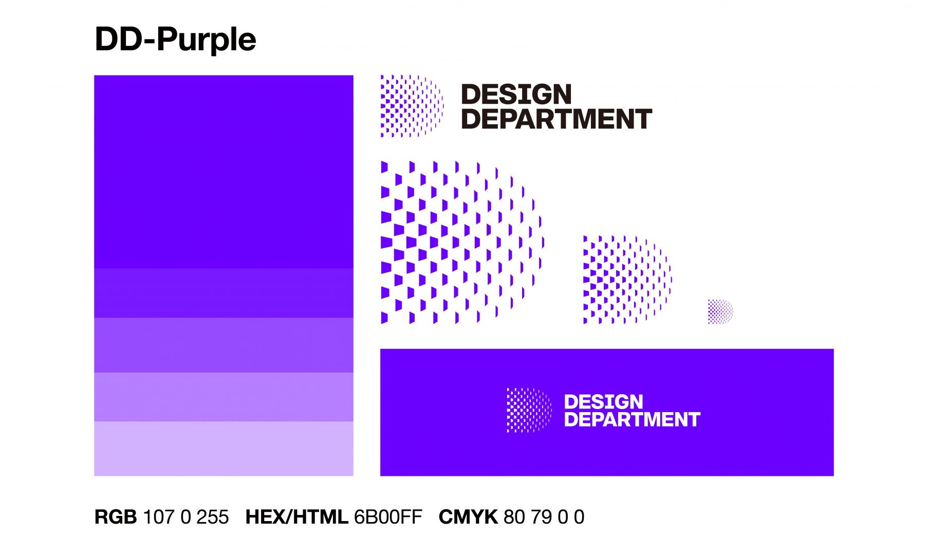
If you need to show our lively atmosphere and can-do attitude with color, try Design Department Purple – “DD-Purple”. It represents the depth of our excellences like keen insights, imagination, and intuition. Its color code is as follows:
RGB 107 0 255
HEX/HTML 6B00FF
CMYK 80 79 0 0
If you need other alternative color option for web or printing, please reference Color test sheet.
Typeface
There are primary typefaces of Design department to deliver consistent visual message via text. If these primary typefaces are not allowed for a certain condition (e.g., web and mobile), you can use alternative typefaces as follows:
- Primary typefaces
- EN: Helvetica Neue
- KR: Spoqa Han Sans Neo
- Alternative typefaces
- EN: Neue Haas Anica
- KR: Noto Sans KR
Who are the F-U-D team?
F-U-D (Face of UNIST Design Department) team is a project team of design department to build identity and administer related stuff consistently with professors and students. As F-U-D means, we maintenance visual languages coherently to make our department as a brand. F-U-D team started to set vision, logo, color and typefaces in Nov, 2020. Taking this opportunity, we have designed various touchpoints where you meet design department such as posters, department spaces and website as you see right now.